I’ve had several people ask me how I make my digital artwork. It’s a difficult question to answer because over the years I have adopted several methods that seem to serve me pretty well. But like most things, each desired outcome relies on specific methods that may, or may not, be part of another outcome.
Ahem….
So, here now I present to you several of my super secret recipes for digital satisfaction. Hehehehe….
Method One: Direct Illustrator Satisfaction.
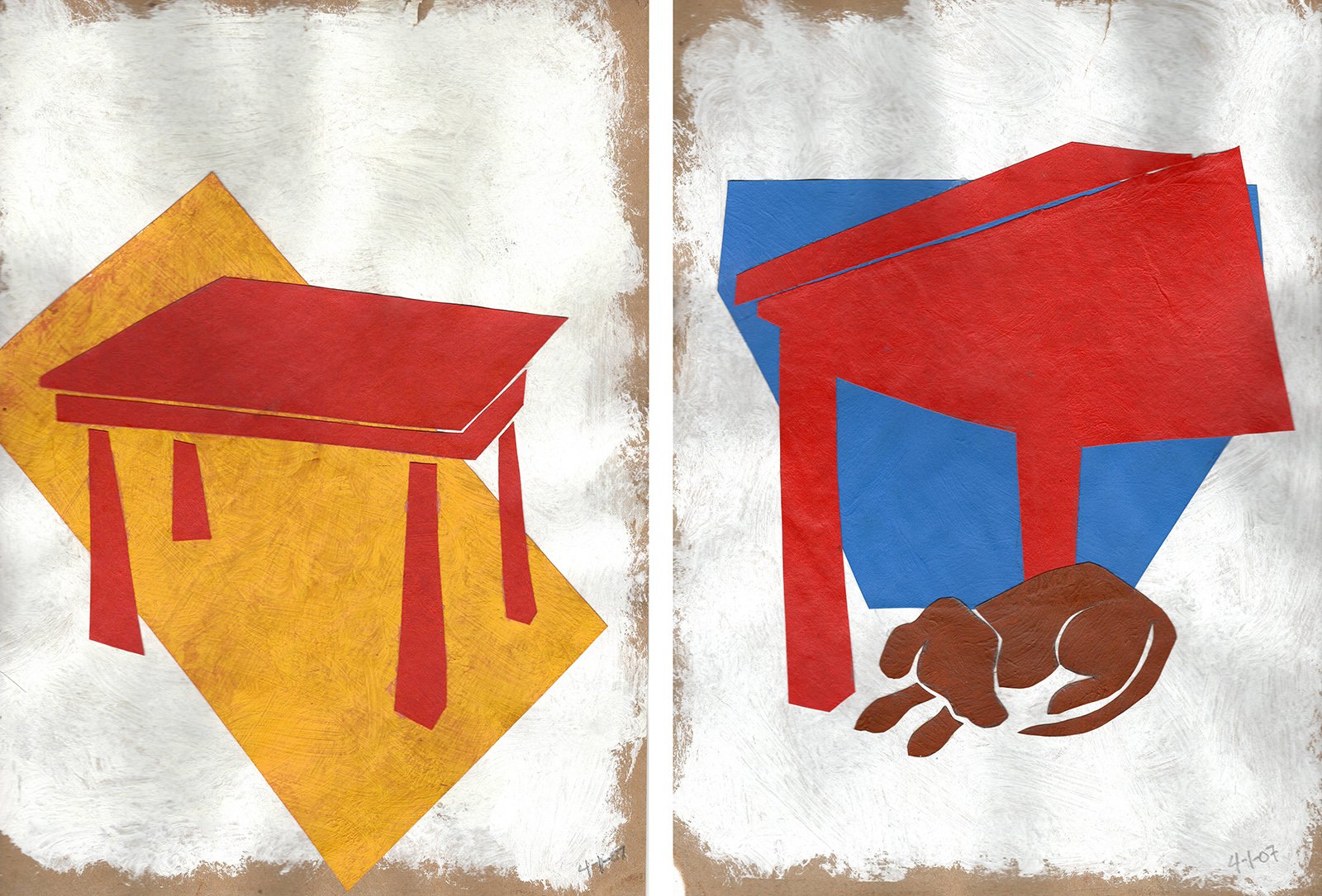
This is the process used for at least fifteen years, and still probably the one which is most comfortable for me. After Adobe Illustrator refined their gradient annotation tool, making gradients supremely variable and much more natural, I began using it as a quick and easy way to create organic shading totally within Illustrator. It takes a lot of finessing to get the gradients correct, and often it involves layering several gradients on top of another with blending modes, but it is a fantastic tool to use when creating smooth subtle and generally realistic (and sometimes stylized) color gradients to depict shading and lighting effects.
The animated Holiday Card I made when I was working at STAK Design is a good example of this. It was actually one of the first projects I made after Adobe introduced this capability to Illustrator’s gradient tool. Before that, you pretty much just had either linear gradients or strictly circular gradients. But the Gradient Annotator opened up the ability to stretch the shape and transform the origin of gradients, making them much richer in appearance than ever before. And now, the gradient tool has become even better with gradient points and lines, which are even more sublime. Ooooooh!

The main elements for the animation.

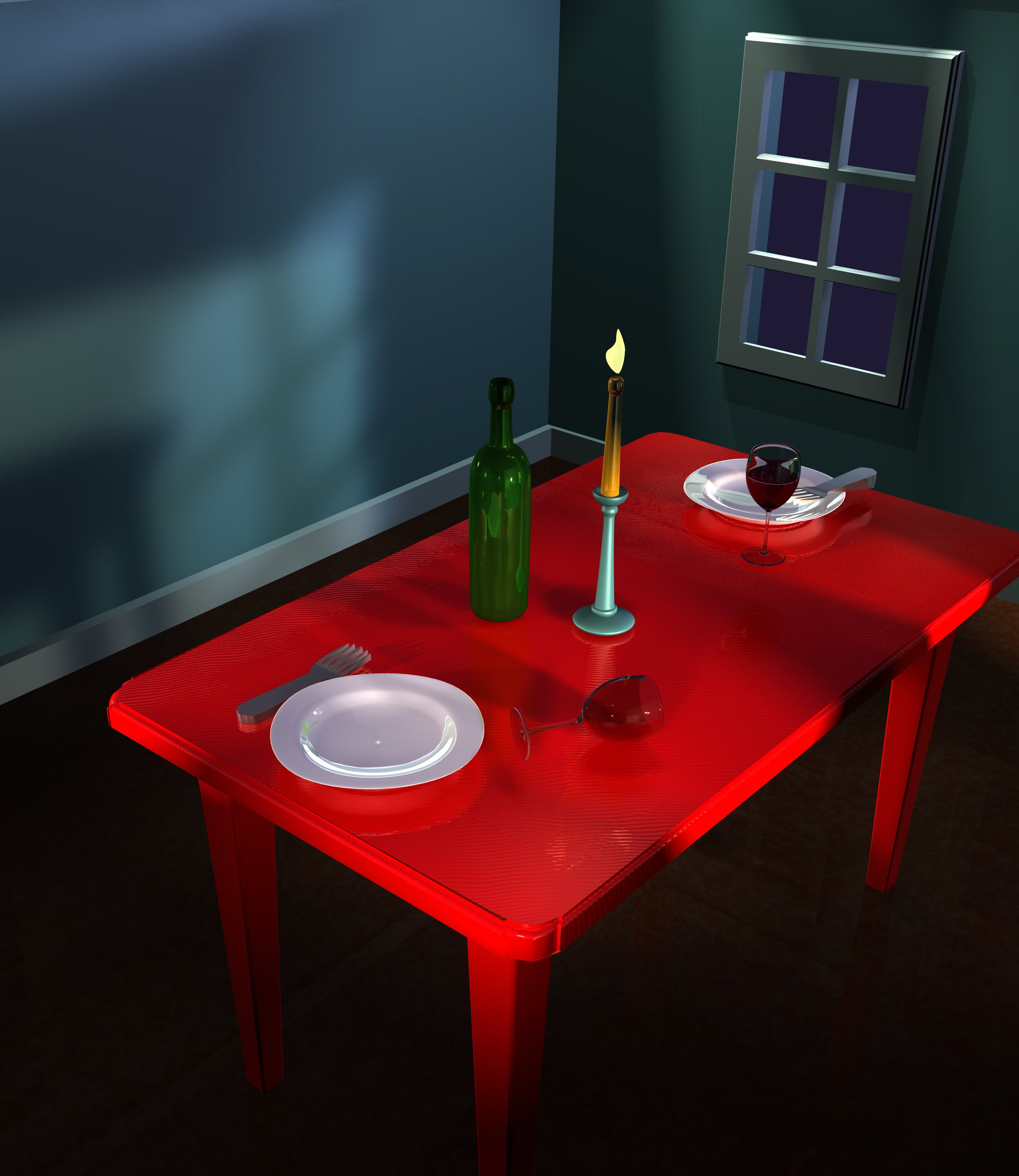
The Illustrator image, showing the objects as outlines.

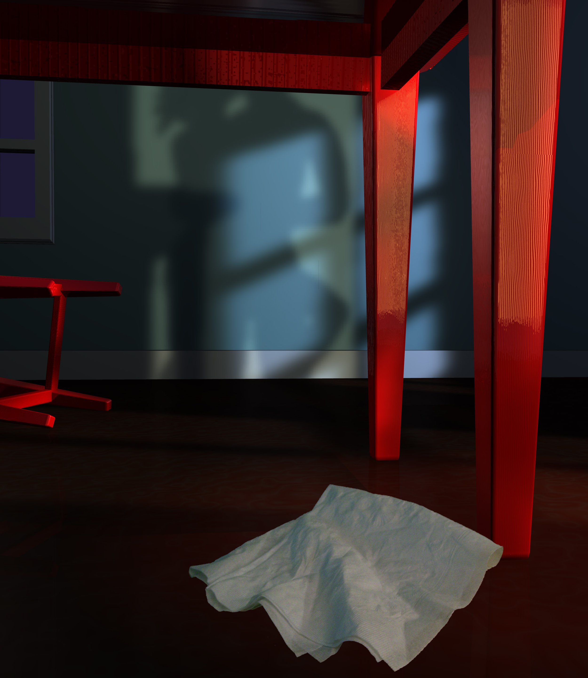
Detail of image with gradients, all in Illustrator.
Method Two: Illustrator Becomes the Prime Object Maker, and Photoshop Becomes the Master Shader.
This is one that generates more organic, naturalistic results similar to OG art, like traditional airbrush illustrations (which I love). It is an extremely time-consuming way to make paintings, because it involves so many different steps. And I always find the way I’ve made one or several “friskets” along the way is not quite right, and I need to go back and edit the path to make the frisket correct. But this is its intrinsic beauty; it has advantages in preserving the various steps used to create the artwork, so later edits are much easier.
When creating these, I generally start with a pencil sketch that is brought into the computer via scan or crude photo from the trusty iPhone. Then I bring it into Illustrator and trace over it to make paths. Those paths are used as “friskets”, or masks (alpha channels) in Photoshop. The paths in Illustrator always contain registration rectangles on the perimeter that are always copied and pasted from Illustrator into the corresponding Photoshop document, so everything lines up automatically when pasted into Photoshop. An old trick I learned in college printmaking classes that has served me well throughout my professional career, no matter the medium.
These paths are used with various layers and blotchy brushes or Photoshops regular brushes set on Bitmap mode to make splatter airbrush effects. It is also used in the same manner in Painter for airbrush friskets.
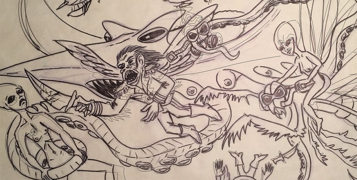
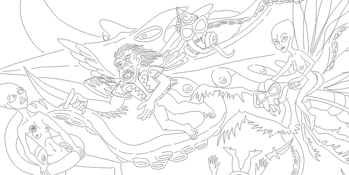
There are any number of examples of this technique shown throughout my portfolio., but here is an example of this technique in action. This is part of the fever dream tattoo idea for my brother.

Early composite of sketches
It all started with a lot of research for the crazy elements I wanted to include. I have a large folder on my computer with images of praying mantids, steampunk airships, octopus, manta rays, the monkeys from Wizard of Oz, etc. Then came volumes sketches, starting in a sketchbook and later going big on sheets of tracing paper. I like tracing paper because it allows for easy revisions by tracing over earlier “almost correct” versions. I think this painting had about a dozen variations. It began with the idea of a giant flying octopus attacking the Alien queen and her entourage, mounted on bio-mechanical preying mantids, and their guardian flying monkeys, who cannot breathe the atmosphere of whatever planet they are on and therefore have gas masks, as they travelled through a sunset sky.

Original idea for background, a composite of 3 or 4 photos in Photoshop

More refined sketch composite
I decided a flying octopus was not strange enough, so I turned it into a mutant hybrid of a shark head, octopus tentacles, and manta ray wings, plus mammalian breasts to indicate it has offspring lurking somewhere, and they are probably hungry.
I created several sketches to find the right combination for this imaginary beast, but just couldn’t quite get what I wanted, so I decided to make a small sculpture to help visualize it. I made an aluminum wire armature for the tentacles and to hold the body parts, and formed the masses with home-made play dough. It finally appeared as I wanted.

Armature made of aluminum wiring

Play dough sculpt of the top of Mantapus

Detail of Mantapus maquette underside. Dig that Jaws mouth!

Mantapus sculpt for sketch reference
From this, I completed the sketches and assembled the composition in Photoshop. But there was another element that I was trying to incorporate that just didn’t seem to fit. Bettie Page is an iconic figure of pulp legend that I have always wanted to include in art pieces, and try as I might, she just wasn’t working when I attempted to put her into this scene. Although the follow-up to this painting, still in progress, includes her as the captain of the airships seen in the distant background of this piece.

All hail, Bettie!
Anyway, the sketches were composited in Photoshop and from there, I opened it in Illustrator and made paths to define the shapes and areas. The line width tool is one of my favorite tools in Illustrator; its inclusion has made creating variable line weights, which simulate variable widths of brush strokes or marker pens used in cartooning and fine arts, so much easier than it used to be, where you had to create a stroked path, convert in into a shape, and manually add control nodes and then adjust the distance between the opposing nodes to taper lines. I adjusted the line widths of all strokes to create a more organic look to the illustration. Each character was on a separate layer to make it easier to see what was going on, and to help select elements separately when I imported them into Photoshop.

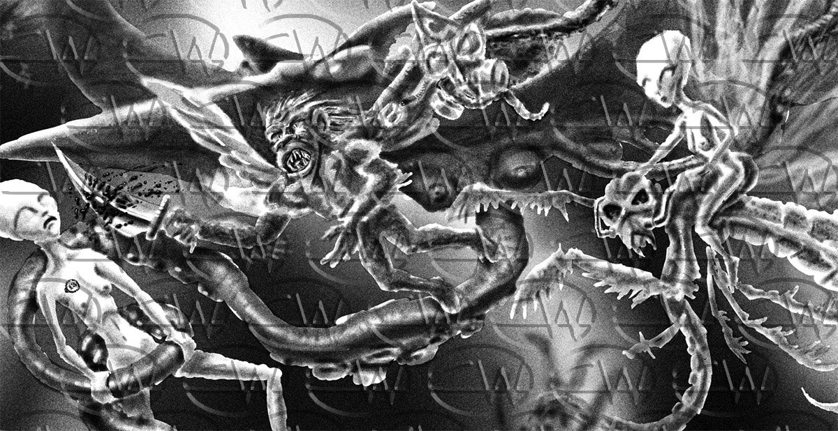
Now comes the fun part! I decided to try something a little different for this piece. I would normally use Painter for an art piece like this one, but because it was originally intended as a tattoo design, I decided to keep it in black & white. In Photoshop, I wanted to simulate a stipple effect like a tattoo artist would employ, so I did all of the shading using brushes in Dissolve Mode, which basically sprays binary dots rather than smooth gradient shading.

Close-up of the Dissolve brush mode used in Photoshop to create this piece.
The piece itself is very large: Nearly 100” x 65” at 200 pixels/inch. It gave the stipple effect a nice appearance. Since then, I have purchased brushes that beautifully achieve this random, hand-made effect, but in 2016 when I made this, I was not aware of these brushes (assuming they even existed back then).
Paths in nature

I imported the Illustrator drawing into Photoshop and changed all the shapes to black. I then created layers for each character and used the lasso tool to make rough selections for the various parts I wanted to shade, like old-school friskets for traditional airbrush paintings. Each element was meticulously “airbrushed” using these selections on their respective separate layer, drawn over the imported Illustrator art. The outlined sketch from Illustrator was placed atop the other layers and turned to Multiply mode.

Some of the characters shaded

All of the foreground characters with shading


Some of the Illustrator outlines needed to be softened, so they would fade into the distance. I selected the area of the outlines using the lasso tool, used control-shift arrow to turn just that part of the outline into a controlled selection, and used a white-loaded brush (again on dissolve mode) on the selected outline to fade out that part.

In the end, the shading by itself appears pretty rough since the selections in this piece were hand-drawn. The overlaying of the outlines is what ties it all together, like a nice rug ties the disparate elements of a room together.
Painting with shading but no outlining

Finished piece (detail) with outlining and shading.