I have been friends with Jon McPherson since we were in high school together. He is now (and for many years has been) a distinguished and award-winning winemaker. I’ve always admired his creative, off-beat sense of humor and methodical manner in his pursuit of excellence in winemaking. Over the years, I have had the good fortune to create some wine labels for his winery. This has surely been to the consternation of the owner of the winery, because he is apparently a man of practical drive and has not the time for whimsy. An old-fashion businessman; get to the point and move on, man.
So this particular tale of design started several years ago, in early 2007 to be exact. I had started a new job with an exhibit company while going through my divorce. I had moved out and was holed up in a little apartment in a not-so-great neighborhood, poring through Cinefex magazine, which featured articles about the creation of special effects for movies, and Illustration magazine, which had beautiful exposés about talented but mainly now-forgotten illustrators from the 1940s, ’50s, and ’60s (a fantastic magazine). My days also consisted of watching the news as I got ready for work each morning, and burning my dinner each night after work. I was also going through a period of watching old film noir classic cinema on Netflix disks (before there was high-speed internet), and doing a few freelance jobs with old clients to make a few extra bucks.
My daughter visited with me at my scary little apartment every other weekend, and one of these weekends we went to the Ft Worth Museum of Modern Art. This was a favorite haunt of ours, along with other local galleries and museums. The Modern had an exhibition of works by Matisse at the time. As a quick aside, one of my former employers was a huge fan of Matisse, and I remember a coffee table book in our studio with his works, including his paper cut-out pieces.
Even though I am a huge fan of Paul Klee and his simplistic assembled paintings featuring whimsical juxtapositions of animals, architecture, landscapes and such, I recall thinking Matisse’s paper artworks in that book were silly, childish, and not really anything special. Too rudimentary to be elevated to the level of masterwork. But when my daughter and I saw the exhibit live, which included paintings, some beautiful sculptures, and these silly paper cut-outs, I was overwhelmed. I was fascinated by the way the paper had been treated, carefully drawn, then cut out with such passion that I could almost see the Artist’s hands holding and carefully cutting out each piece and then meticulously arranging them on the pages. I could see his thought process inscribed in the almost invisible pencil lines covered with paints, and the devotion to his artistic ideals.
I was transformed by the simple elegance that I had not recognized by looking at the photos in a book.
Skip ahead a few months. I got a call from Jon, who had a batch of several red wines that were not of sufficient volume to bottle as small batches, so he was going to blend them into a superb table wine. He wanted a unique label for the blended wine, something distinct from South Coast’s normal branding, because their traditional branded wines are normally high price-point, and this, being a blend, had to be sold for $10 range — so it couldn’t sully the main brand. He laid the name on me: “The Big Red Table”. He said he wanted the label to feature a dining table painted red, so there was a pun involved in the name. I told him I would give it some brain time.
Sometime later, I was reminiscing about the Matisse exhibit, and I had a sudden vision of the label a la Matisse. Treated, painted cut-out paper shapes on painted paper. Abstract, bold, immediate. I thought it also had to have some sense of scale, and for some reason I imagined a dog curled up napping under the table for the back label. I think I had seen a commercial on TV that lead to that slumbering canine detail.
Eureka! I had it!
The first doodle of the Matisse paper labels
A few quick sketches should suffice.
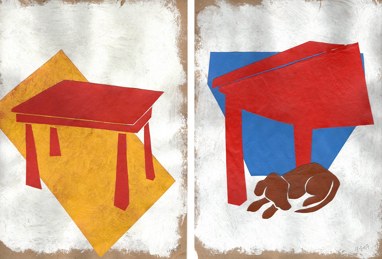
I went to work in my little apartment, painting construction paper and cutting it into shapes, trying different versions and “view angles” as I imagined master Matisse had done so many years before, making a small sample of my idea. I went through several options before coming to one I liked, and I then emailed it to Jon.
The front and back labels captured on painted, cut-out paper
I got on the phone with him and explained the rationale behind it. Jon, being a creative, art-loving guy, thought it was fantastic. He understood it right away, but he admitted he might have some difficulty selling the idea to the owner.
In the meantime, I made larger pieces based on the small maquette version. Full steam ahead! It was only paper, after all.
larger version of the two labels
A few days later I got the call. The owner didn’t get it. Even though Mr. Carter collects art, he prefers Americana, traditional Remington-style art. He wasn’t having the weirdo European-flavored art on his labels. So back to the drawing board, as they say.
Jon and I still liked the idea, so he suggested to try presenting it in a different style. So I made a more painterly version; a rough acrylic painting on a small piece of paper, keeping the same idea of the big table and a dog sleeping under it. But that attempt fell flat as well, with Jon and even in my own mind. It was just a sloppy, meaningless painting. It lacked spark.
Thinking about it in hindsight, I think the dog is what actually killed the idea.
Jon is a cat person.
At that point, my day job was crashing down on me. It was time for the big annual trade show that most of our clients attended in Las Vegas. Thirty-some-odd client-companies, each with a multitude of different types of graphics for their booth. Hundreds of graphics under my management — my first year doing this at this new job. I was not really prepared for the volume of work I had to deal with. I had to shove The Big Red Table in the back of my mind in order to keep afloat in the deluge of work. It was panic time.
I slogged through the two and a half months of production phase for the trade show, then went to Las Vegas to install and supervise installation of all of these immense exhibits. It was overwhelming. May was horribly hot in Las Vegas that year, and there were all sorts of problems; I remember when I first touched down at the airport my phone lit up with the office calling to tell me an entire crate of client graphics was missing. I wasn’t even off the plane yet. For the better part of a week it was nothing but graphics missing, colors wrong, clients deciding to change graphics at the last minute, etc etc. Things were looking bleak. I was sure I’d be fired upon my return to Dallas. But things started to clear up after four or five days. Those local vendors in Las Vegas are accustomed to last-minute, late-night rescue missions for us poor bastards on the trade show floors, and they have always been saviours.
I remember walking through the Las Vegas Convention Center on the day before the show opened, when all was finally looking like we were going to make it out alive. My head began to clear. The panic abated, at least for a moment. Something on the show floor caught my attention and made me think, somewhat randomly, about one of the articles in Illustration magazine; some artist who did pulp magazine covers. And I witnessed, as I walked through the chaotic Convention Center hallway, two people sneaking a kiss. It made me wonder how, in this calamity, they had found each other, and what was their story? Married? Co-workers? Secret lovers? I’ve seen friendly hugs in this environment when old friends reunite, but a smooch? Nah….
At that moment it all hit me like a flash. It was all there in one big roll of the cosmic dice. The Big Red Table was about a pulp romance magazine cover, a torrid film-noir affair, sprinkled with a hint of mystery.
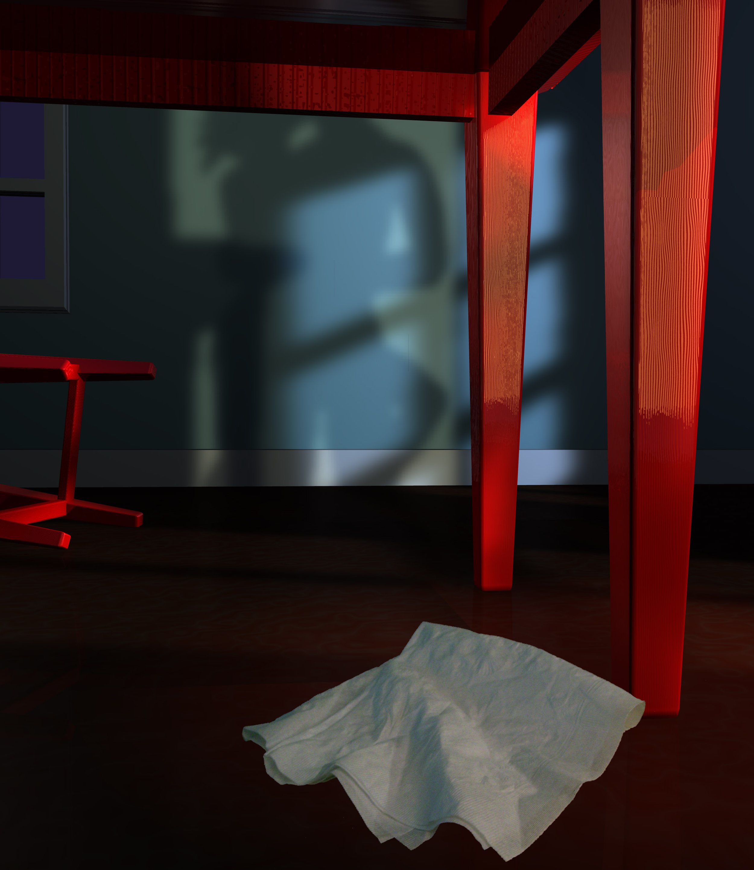
And the napping dog under the table was replaced with a pre-tryst lipstick smeared cocktail napkin, just like in the movies.
Several pages from my notebook, showing the early ideas for the labels and the shelf-talker, detail of the shadowplay on the wall, and the initial logo layout.
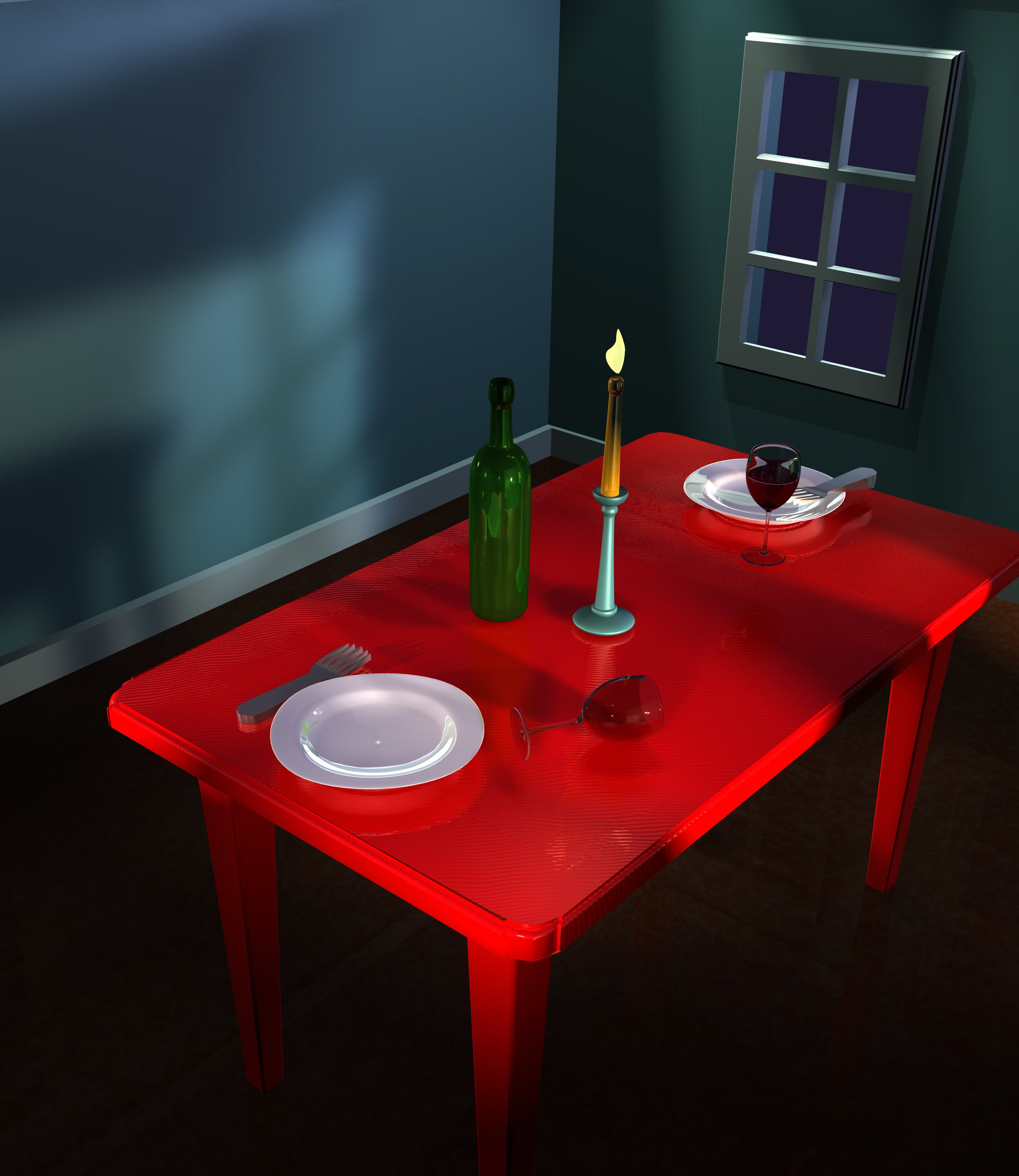
I made some rough sketches and called Jon as soon as I got back to Dallas. He was excited and he wanted to see it. I made a quick 3D model of the interior of a dining room, a photo of a cocktail napkin Photoshopped into the rendering, and used the rendering of the scenes to make the digital oil paintings in Painter. I wanted these to have that loose, hand-painted old-style illustration feel. I created the logo and pulp-magazine style layout for the labels in Illustrator, and wrote some stand-in description text for the back label (Jon always writes his own back labels, describing the balance of different tastes and characteristics of the wine). Compiled it all in Illustrator and sent it to Jon. Then waited.
Rendering of 3D model
Rendering of 3D model
The final Front label.
The final Back label.
He called me a few days later. He had shown it to the owner of the winery, and said I had “Knocked it out of the park.” Jon said the owner didn’t love it, but he understood it and thought it was unique enough to sell. He said he would keep my stand-in description as is because it fit the theme so well, and another fruit-filled description of another red table wine just wouldn’t be right. I felt honored.
And as it turned out, it won several awards for most unique label design.
It was one of the most rewarding, although hard-fought, designs I had made to that point.
So thank you, Raymond and Celeste. Whoever you crazy kids are.
Shelf-talker art for promotional pieces, with the romantic shadow play and the watching detective, to add some mystery.
Now, go check the window, then let the dog out.


